Bitfactor
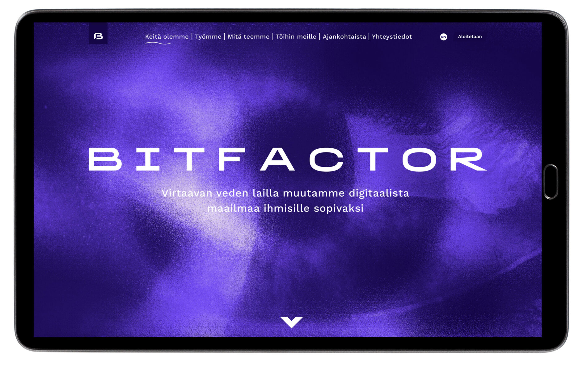
I refreshed, or actually finished up a brand renewal for Bitfactor.
CustomerBitfactorRoleAD, Motion design, ValokuvausYear2021Linkbitfactor.fi
Reference page
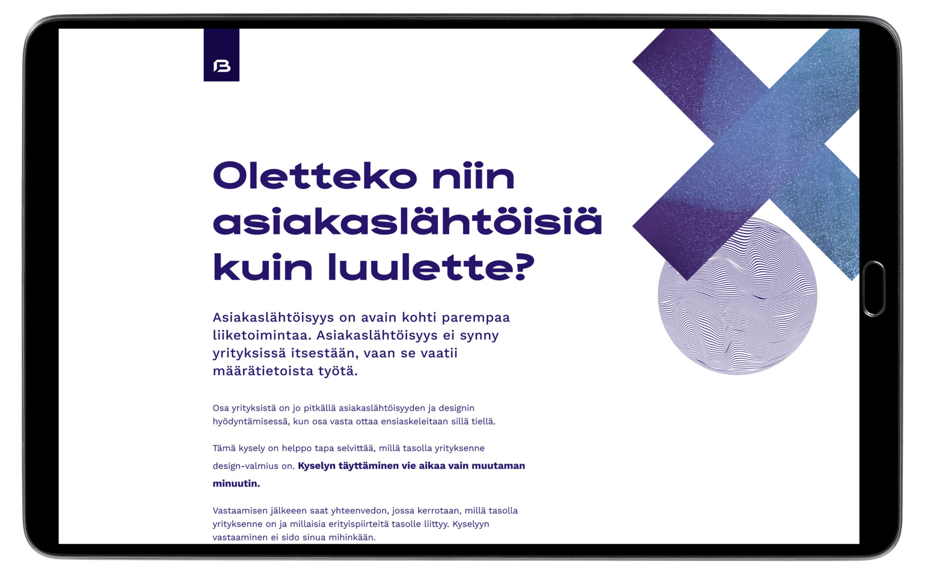
The idea was to show what Bitfactor can do. However, the look has to be a hint of corporate, not just design, because Bitfactor IT company nonetheless.
However, the scale is more on the design side, as the name of the Bitfactor, for example, requires a bit (!) of design compensation. Similarly, the design-side awareness of Bitfactor is maybe not that well known yet.
The page must also be suitable for different target groups. For recruiting the best brains on the market, as well as for customers with different customer needs.
Brand renewed
Ivalo made a brand renewal of bitfactor about a year ago. They defined the colors, fonts, slogan and logo. I went on from that and took a look at the implementation. I changed many things, but left the key elements in place.
Be Water
The theme of Bitfactor is water and the slogan is water. “We believe in movement and deformation, in flowing water. Be water, be water. It sums up the philosophy of all our design. Always in deforming water. A soft growth importer who always finds his way and yet cuts steel and splits mountains when needed. ”
I also wanted that fluidity of the water theme for transitions and the movement of elements, so that not only the look, but also the feel would be fluid and floating.
Immersive site
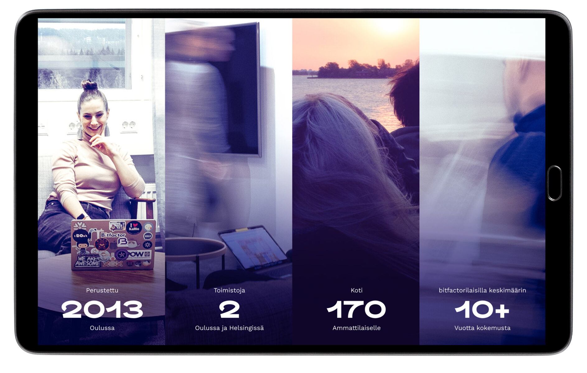
I wanted the experience to look good and be immersive. One where the user would stay to explore the page just to see what happens next. So for example instead of listing key figures of Bitfactor, we did it with animating slides.


